Moderation
As an interior designer, I love color. But in miniatures, a balanced color pallet is more important than i real life. It’s best not to go overboard with too much of a good thing.
Proportions
There is no exact formula for allocating color to walls, furniture or accent items the. The 50/25/25 is a good rule of thumb and the picture chosen follow this guide, more or less:
Primary color, 50% – usually a light color on the walls;
Secondary color, 25% – furniture, drapes. Vary the shades;
Accent color, 25% – accessories and accent wall. This would be the “pop” color.
And remember, whatever color you choose, be consistent. Varying the shades of a strong accent color tends to make the room look “busy.”
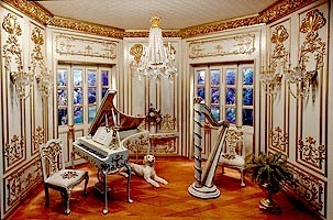
In the Music Room miniature above, white is the primary color, gold the secondary, and the teracota parquet floor the accent color.
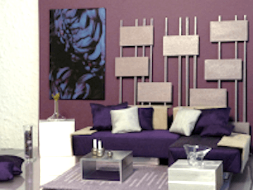
In the contemporary room I found on Modern Mini Houses, we get a peak at a white wall on the left. That would be the primary color in the room. The accent wall, that Benjamin Moore calls “pinot grigio grape” would be the secondary color. Third place goes the plum on the sofa and love seat and the throw pillows.
Large Windows
If your room box has of side widows, the proportions,of your color palette might be 60/30/10, where the diminished wall space gets the 30%, giving prominence to large pieces of furniture and/or an accent wall.
Accent Walls – Careful
Red walls in a bedroom would be overwhelming and too stimulating, but appropriate if your project is a bordello. However, one small red accent wall can be stunning, if the rest of the room coordinates with a small “pop” of the same red showing up here and there in the room. But again, don’t go too far … some roses on a table, perhaps, or a throw pillow,
Be thoughtful in choosing colors, but don’t be timid. At the end of the day, the colors have to please your eye.
Susan


