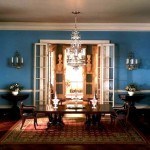
Miniature Buckingham Palace Drawing Room – the most expensive exhibit at the Taiwan Museum, found on Rash & Mayur’s Shoebox on Flickr
Negative Space In Miniatures
Avoid A Crowded Look
Keep this in mind if you want your room box to feel airy and spacious, or as I like to put it, “think about the invisible.” Create as much unused space as possible in your miniature. This doesn’t necessarily mean less furniture, but being more selective in choices available, in whatever time period you are working.
For example instead of having a sofa that has a skirt all the way to the floor, have one that has the legs visible, so that you can see underneath. That’s the “invisible” part. You don’t see the bottom of the sofa. You only see the seat and back, but your mind knows there is probably empty space under there. Sure enough. Hold the box at eye level and you can see all the way to the wall. This gives the illusion of a small block of a space being used, rather than a large block.
The same is true of tables, which should have relatively thin tops and legs if the style of your project allows. This gives the effect that the table is using less visual space. Add a mirrored top, if authentic, reflects more space.
Curtains, Knick-Knacks & Books
Sheer curtains give the viewer the feeling that they are seeing beyond the room. A single large piece of art appears to take up less wall space than a grouping of pictures of the same overall dimensions.
Keep books and knick-knacks on flat surfaces to a minimum. Book cases with open backs appear less bulky than enclosed ones. Instead of a solid mass of books, use a clear vase, a stack of two or three books or a picture frame on one of the shelves. It looks as though you can see right through to the wall.
Apparent Traffic Flow
These suggestions are relevant only If your project emulates reality. Recreating a memory might require using of as many meaningful objects as possible.
Furniture spacing is another way you can give the miniature room a more spacious feeling.
Make sure you don’t interfere with traffic flow. Don’t block doorways, so that a person would have to go around a chair or table. Traffic should “flow” like a stream, unblocked by obstacles.
Cheating Is Good
If your room box can be viewed from the top through glass or a vinyl sheet, be careful about putting a coffee table so close to the sofa that in real life, a person would have to squeeze by to sit down. If your miniature can only be viewed from the front, it’s okay to cheat a bit if you have to balance perspective.
Don’t block windows with furniture. And try to keep from having furniture lined up against the walls. Rather, have a grouping of furniture for people to sit close and have a conversation. And be surrounded by negative space.
Rugs Can Be Your Friend
Rugs can help establish the boundaries in a room by anchoring the furniture. Put the front legs of a sofa on the rug, back legs on the bare floor. If you angle furniture across a corner, do it with more than one piece. Or angle the rug, too. The idea is to arrange right angles for each object. One lonely piece just looks like you’ve cut off the corner.
If it’s a modern dollhouse, please don’t have all of the furniture aimed at the TV. The living or family rooms are for relating with people, not staring at a boob tube. Unless, of course, you’re making a statement about the times in which we live.
Susan


