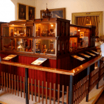

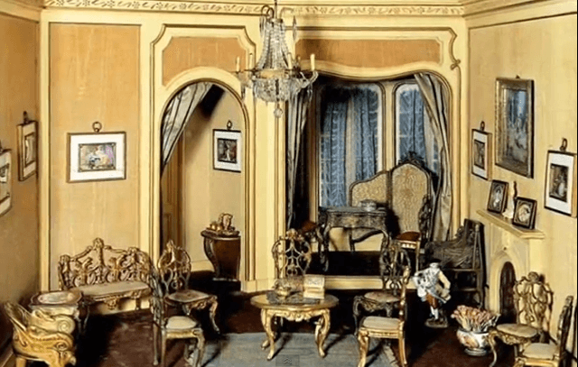
Helena Rubinstein collection. The Second Empire Room Box
Neutrals Beige vs. Gray
When working with beige, as with any neutral color, I like to have more than one shade in a dollhouse miniature. Go from light to dark hues on the walls, rug, and large pieces of furniture. The walls could be the lightest shade; curtains, a filmy darker tone; the rug a much darker shade. Because of the compact space, making an unfortunate choice of color in a miniature is more noticeable than a real dwelling, but fixing it is a lot cheaper.
The room box in the Helena Rubinstein collection shows various shades which might be labeled a rich, creamy beige, with spots of darker color in the flooring, curtains and wall art.
Textures
If your sofa is beige leather, the pillows and throw can add color and varied textures. Mix it up with velvet, burlap, long hair, rope or large weave fabric. The rug could be sisal or long shag. Since beige is so neutral, you could take any favorite color and use it for a color “pop” here and there. If blue is your favorite color use art on the walls with your favorite shade of blue, then make sure this accent color the is same shade wherever you use it. The blue in the artwork should be exactly the same blue as in the vase on the side table or the blue in the flower arrangement on the coffee table.
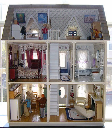
Melanie Fletcher’s Cape Cod Salt Box (sorry, link is broken)
Gray Is The New Beige
For dollhouse miniatures, the choice between beige or gray is strictly personal. You still want to use more than one shade of this primary color in the room. Make sure your secondary and accent colors are compatible with that primary color.
Melanie Fletcher took a different approach in the Cape Cod saltbox she made for her niece. All but one of the rooms has the same shade of gray on the walls, with a few strong accent colors. The overall effect shows a subtle unity rather than a kaleidoscope of colors leaping out at you.
I love working with this new-again neutral color because it seems so fresh, and because of the emotions, it can evoke. Log onto the Benjamin Moore website and look for Shades of Gray. For a warm, cozy feeling, you can’t beat Cosmopolitan. Need a quick cool down? City Shadow is for you.
If you choose your accent colors carefully, you can do wonders with gray. How long before beige reappears as interior decorating’s “exciting new thing?” Who knows, and who cares, really. In dollhouse decorating, the latest fad is irrelevant. We deal with decades and eras, right?

Josje Bouwt Selfie
Have It Both Ways
Of course, you can have both gray and beige with a pop of gold leaf in the same frame, as in the Josje Bouwt selfie. Click on the photo to link to what I think is one of the best blogs for dollhouse miniaturists, A Beautiful World.
Susan Downing, with Patrick Owens
_________________________________________________________________________
I invite you to visit my Etsy Shop where I offer many accessories and pieces of furniture in 1:12 scale.