Creating A Color Scheme
If you are starting a project from scratch, without a photograph from which to work, creating a color scheme can be a daunting task. There are so many choices, especially with contemporary and modern dollhouses. Where does one start?
The First Step
What are your favorite colors? Even if they are not currently in fashion, favorite colors will always resonate with you. Look in your closet. What colors do you wear most? Or your favorite colors might be in a painting, poster, or photograph. What scene in nature brings you pleasure? What colors do you see there?
Next, the general vision, the mood you want to create, how you want your space to “feel” – fresh, cozy, moody, bright. Keep in mind that a color choice can easily set the mood of the room. Once you have determined the feel, keep this in the front of your mind when determining your color palette. As you make each color decision, ask yourself, “Is this color choice lending to my overall desired feel?”
Where The Samples Are
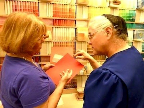
Visit a fabric shop or a paint store to get sample swatches to mix and match. All of the above are good triggers to spark inspiration, but they are just the starting point. Don’t let them fence in your imagination at this point. You are not picking specific shades yet, but simply trying to get an overall impression of what you want your space to be.
A color wheel is a big help in implementing the feel you are trying to achieve. Colors close together on the color wheel are analogous and tend to be calming. Colors that are farther apart are complementary and can add drama to a room. Warm colors like red, yellow, and orange have an energizing effect. Blue, green, and gray are soothing. There is a link at the end of this post to a very good Better Homes & Gardens article on using color wheels and charts.
Decision Time
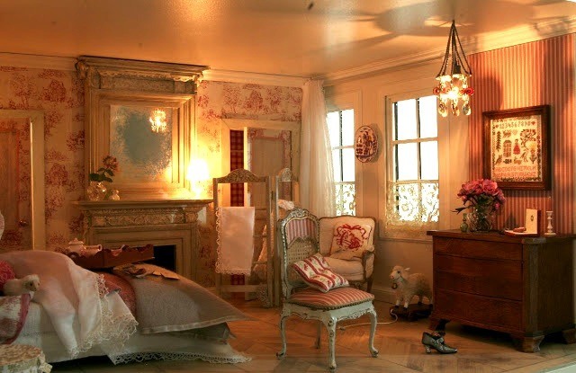
Time to dive in and choose your base or primary colors. Walls are the largest area in your room, and their color(s) can easily set the mood of your space. So tackle that first. Keeping the mood of your room in mind, select two colors that can function as flexible background colors. Base colors, other than pure black and white, should be muted, slightly “off” the primary color, because that gives you the flexibility of working with both cool and warm tones. For instance, in Josje Bouwt’s sleep chamber at the top of this post, the wall and ceiling color is probably an off-white, ivory perhaps, with soft lighting reflecting the pinks and reds. The gold leaf on the mirror frame will add blink to almost any color scheme.
Whatever your favorite colors are, think of the base color as a large canvas on which you will paint the accent colors with accessories. That’s the fun part of creating a color scheme.
Here’s the link to the BHG Color Wheel article.
And you might find my post The Neutrals, Beige vs. Gray, helpful.
Patrick Owens
_________________________________________________________________________


