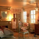


Thorne Room – Jacobean Reception Room – 1625-55, found at Art Institute Chicago
Wall Art: 3 Spacing Ideas
It seems that I have followed a Rule of Three in my decorating assignments:Minimalist, where a single piece of art over-powers everything else in the frame; Maximum, where a cluster of pictures give the impression of a single image filling the frame; and Moderate, which I was supposed to
have learned at my mother’s knee. You’ve got it, “moderation in all things.” To me that’s the traditional way of hanging paintings, a few well-lit works being in balance with the room. The three pictures below show what I mean.
Moderation
You can’t go wrong with the traditional way of hanging art, as shown in the Thorne Jacobean Reception Room above. In this case, the ‘frame’ is the space to the left and right of the fireplace. In other rooms, the frame could be the space above a chair rail and between two windows. Remember, there is always a frame and it’s your job is to place the art in it … just so.

Dining area in a Safety Harbor, Florida home, designed by Susan Downing. The fabric art from the Marimekko catalog.
The easiest way to get the spacing right is to lay the pictures on a piece of paper and play with combinations until you get what you want. Trace around each object and use that as a template to attach the photos to the wall.
Minimalist
The sidewalk cafe fabric art in the dining area came from the Marimekko catalog. The house had cathedral ceilings and that 12-foot terra cotta faux-brick wall was depressing. I convinced the client to paint it white and brighten the dining area with a piece of art that had a connection to food. Cool, isn’t it? The client loved it too when it was done.
For a piece of miniature fabric art, “audition” a large-pattern material with a window cut out of a piece of card stock in the scale in which you are working. Keep looking ’til you find what you want, and buy the minimum amount off the bolt that the store will sell you.
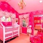
Maximum

Wall Art Cluster from the Marshall Erb designs portfolio
A grouping of pictures should be thought of as one unit. Marshall Erb’s use of space, not only accomplishes this in his cluster of pictures in this real room, but he maximized the limited space available by putting the dining room table in an alcove created by ripping out an unused walk-in closet in the room on the other side of the wall. Brilliant! And you can do the same thing in a miniature room.
Lighting There are so many ways to light room boxes and dollhouse now, this should not be an issue. The spaces we deal with are so small, track and spotlighting should not be necessary. Try to build up the light level so indirect illumination is enough. Let the color in the artwork do the talking.
Here are two other articles on organizing space in a miniature: Disguise Window Size and Negative Space.
I hope these articles are helpful.
Susan Downing