Increase Apparent Space
If a room in your project needs a more open feeling, changes in the amount of light or the color of the wall can visually increase the size of the space.
Wall Color
A fundamental change would be the paint color. Evaluate the color tones used and see if they can be lightened without going to a stark white. Always keep in mind that the darker the color, the smaller an area will
appear. Dark tones have this same effect on other objects such as furniture and rugs. If at all possible keep the walls on the lighter side and use dark tones on the furniture.
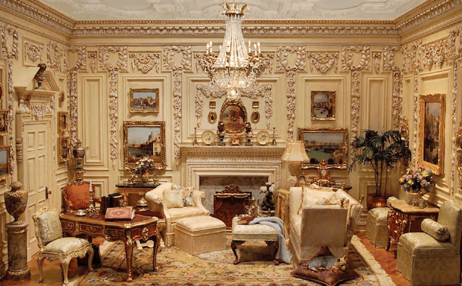
There is a lot going in Ron Hubble’s Jacobean inspired room box pictured above. If the dollhouse era is right, trim can do wonders to make a flat surface interesting. Here the wall surface is monotone, a creamy white or beige, depending on how much light there is in the room box. Ron used Baroque and Rococo scrollwork and trim, and a Chippendale cap on the door frame. Small and medium-sized paintings add spots of color; the gold-leaf frames and the crystal chandelier add an appropriate amount of bling. More color is added in the furnishings.
Wall Covering
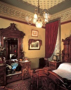
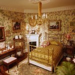
Vertical patterns appear to heighten the ceilings; horizontal ones widen the room. It was the Victorian fashion to break-up the horizontals into three sections. One pattern at the cornice, another above the dado (chair) rail. This was usually a texture or small pattern so as not to conflict with pictures hung in this space. A third pattern filled the space between the dado rail and the baseboard. This design would be excellent for the late Victorian and Regency period. In any other eras, it might be over the top.
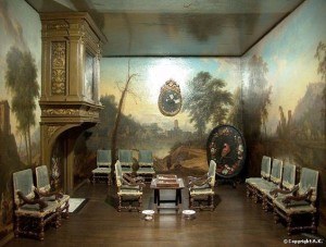
The sitting room of Petronella Oortman’s cabinet dolls house, on exhibit at the Rijksmuseum in Amsterdam:
No Walls At All
Take a close look at the picture of the sitting room in Petronella Oortman’s dolls house. While there are no windows, the artisan appeared to make the walls disappear with huge outdoor murals. The ceiling is reflective, adding to the feeling that this 8 X 12-inch dolls house room has no boundaries.
It’s All Done With Mirrors
Mirrors are the miracle workers of small spaces. They give the appearance of an opening without an opening actually existing. Have you ever walked into a room where a mirror covered an entire wall, and at first glance, you thought the room was twice the size it really was? It may not be necessary to cover a whole wall with a mirror, but a mirror may be all you need to open up an area.
Light
Another factor to check is the amount of light in the room. Is light coming in anywhere but the front? If you have window openings, use them to your advantage. Open the blinds and push back the curtains. If the window treatments are big and bulky, consider replacing them. Heavy window treatments may overpower a small space. If a replacement is unacceptable, add more light fixtures to brighten things up. If you are working with a room box, consider using a plexiglass top. It may wash out the contrast in the room, but adding strategically placed lamps can fix that.
The Key Word: Appearance
I have used various forms of the word ‘appears’ a lot in this article because my suggestions have mainly been visual tricks. But really, the first step in making a room look larger should be to scale down the furnishings. Do you have too much stuff in the room? Is there a choice in the period in which you are working between bulky and trim-line furniture? Showing a bit of sofa leg creates the appearance of space. If a rug is necessary, go for a smaller size. Clear a pathway. 1:12 scale people still need to get from point A to B without having to walk sideways.
I hope these suggestions are helpful to you. Enjoy experimenting.
Susan Downing, with Patrick Owens


